Portfolio Development

In parallel with the work on the showcase site, I have been getting up to speed with the functionality of RapidWeaver and exploring the themes available. Sticking with the Parallaxis theme for my portfolio and also possibly using it for the linking pages on the Showcase site, I have been looking at further effective layouts of both portfolio/agency sites and also sites using the parallaxis function.

Coal / Face is a digital agency in Newcastle and their site is a fine example of simple, modern layout with a nice use of texture, background patterns and minimal colour. They have some eye-catching additional touches using jQuery, to show off their flare without jarring with the functionality of the site. I like the dial in the footer particularly.

Screen Shot 2013-05-02 at 12.09.10 Screen Shot 2013-05-02 at 12.08.41

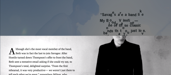
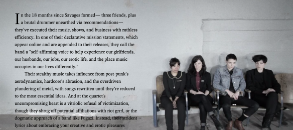
I have also been inspired by the forward thinking design on Pitchfork’s website which is utilizing very advanced programming to showcase some its features such as key interviews and their Advance service. The current interview with Savages is presented in a stunning format with awe-inspiring parallax scrolling, unusual typography effects, with letters appearing to fall away when scrolling, use of full screen video, all combined with clean typography. I wonder if this style of presentation may be the way more and websites choose to present certain features.

Screen Shot 2013-05-02 at 12.19.13 Screen Shot 2013-05-02 at 12.18.47 Screen Shot 2013-05-02 at 12.18.34 Screen Shot 2013-05-02 at 12.18.16

Finding inspiration online

In order to start finding ideas about how to present my portfolio site and find inspiration for the group project I have been browsing through agency websites and design blogs. I am looking for novel ways to present my work in a stylish, modern way. I want to incorporate some interesting effects and also use full screen imagery, which is in mode at the moment.

This site lists many sites which have eye-catching visuals: AWWWARDS

I like the simplicity and interesting twists to the shapes here: http://rallyinteractive.com/

Screen Shot 2013-03-27 at 10.36.20

http://www.8bisbranding.com/ uses big image blocks – also a style that is popular at the moment.

Screen Shot 2013-03-27 at 10.38.22

I like Unfold‘s single page approach too. Classy, angled shapes with clean and minimal colour usage. The design bears a lot of influence from the Swiss school.

Screen-Shot-2013-03-27-at-10.50.59

Oak has used big image blocks too and has exaggerated the size even more than usually seen. It works though. The site is easy to follow and the approach is confident, risky but successful.

Screen-Shot-2013-03-27-at-10.56.12oakcreen-Shot-2013-03-27-at-10.56.12

Here’s another minimal, image-based site for an Australian designer, Longton Design.

longton

This freelance designer in Arizona has made a stunning website using the scrolling effect to animate the cat that forms the key branding to the site.

Interactive product designer Andrew McCarthy offers some serious scrolling fun. First faced with a cat silhouette, the scrolling soon enables the cat to run through a series of stunning colours.

As you scroll, you’re able to see details of Andrew’s past experience, skills and contact details, making it a truly fun-packed portfolio that will surely catch the eye of any potential employer.

Scrolling has become one of the key trends in web design of the past few months. Not just scrolling up and down but left and right. Creative Bloq last week pulled together some of the recent thinking behind this technique.

Screen-Shot-2013-03-27-at-11.24.43